This is an update to my previous post on building a 3D visualisation of the UK Climate Projections in Lego.
In my first trial, I built just the map of Scotland. The main revelation was how difficult it is to do anything with Lego’s standard packs of blocks, which are a multitude of shades and shapes. In my second trial, I had increased access to thousands of blocks. But it was still tough to create a map of the whole UK in uniform colours. And for some reason, the 1×1 studs in yellow all had portholes on the side.
What of the data being visualised? My first trial recreated a map from the “Worst Case” issue of the Little colouring books, based on the UK Climate Projections 2009. For the second trial I brought the data up-to-date; I downloaded a sample from the 2018 Projections, the new standard.
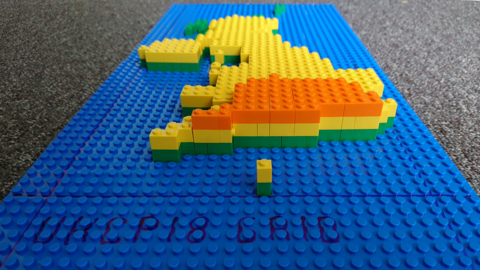
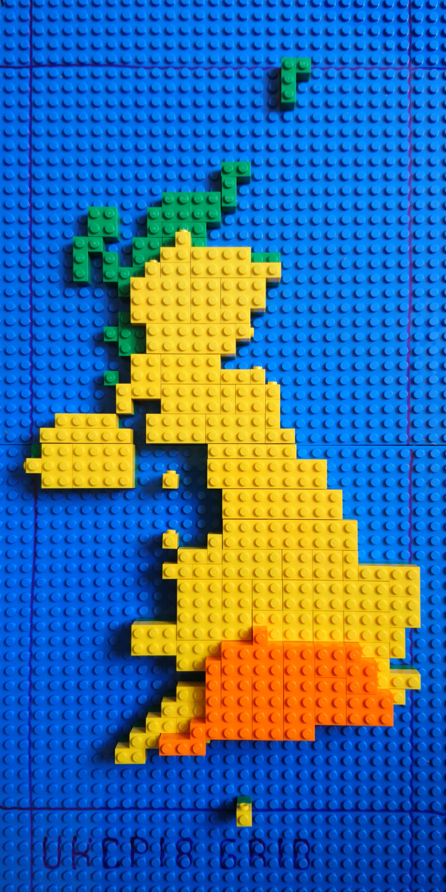
So here is the °C change in the mean temperature, compared with the 1961-90 baseline, by 2060-89 (no, I don’t know why it’s not 2061-90), in the summer (June, July, August), taking the 50th percentile (the one in the middle) estimate under the RCP 6.0 scenario (also the one in the middle, if you discount the very lowest which is sadly unrealistic).
Key:
- Blue is the sea 🙂
- Green blocks mean an increase of 1-2°C
- Yellow means 2-3°C
- Orange (including Exeter) means 3-4°C
Finally, a big thanks again to Holly Henderson at the Business School.