This weekend was NASA Space Apps Challenge 2019, and I joined the Time and Tide team to address the Rising Water challenge: “Sea levels are rising around the world, and approximately 40% of the human population lives in coastal zones. Your challenge is to help communicate the impacts of rising oceans by creating a visualization tool that illustrates the changes caused by rising sea levels in your region.”
The previous day, I’d attended a set of tutorials run by TechExeter and the Met Office Informatics Lab on using Python to work with environmental datasets, and was keen to put some of this into practice. Also, fellow Kaleider resident Andy Wood had brought a Joto interactive whiteboard along with him, and I was hoping to have a play.
Which I did, and here’s my pilot visualisation of rising sea levels at the Tower of London, sped up!
But to rewind back to the beginning… the problem is rising sea levels under climate change, and the challenge we took on was to try and create some ‘slow visualisations’ – depictions of environmental change that maybe disrupted the usual tropes and that kept changing to hold attention and encourage engagement.
One of the tasks we set ourselves was to combine sea level data with contour maps to produce flood risk visualisations. En route to this, we also considered sea level rise at three famous points on the Earth’s surface: Statue of Liberty, Sydney Opera House, and the Tower of London / Globe Theatre.
I went deep into the NASA data catalogues looking for historical and future sea level data. There were moments of frustration when it was proving difficult to get access via NASA to data produced by the Met Office, while sitting in the Met Office. But here’s what I came up with, plus the whole Jupyter notebook saved as a pdf.


Sea surface heights (m), RCP8.5 ‘worst case’ scenario
| Location | 2018 | 2099 | 2199 | 2299 |
| Thames Estuary | 0.01 | 1.71 | 2.95 | 4.14 |
| Sydney coast | -0.12 | 2.25 | 3.31 | 4.65 |
| New Jersey Bight | 0.07 | 1.19 | 2.32 | 3.83 |
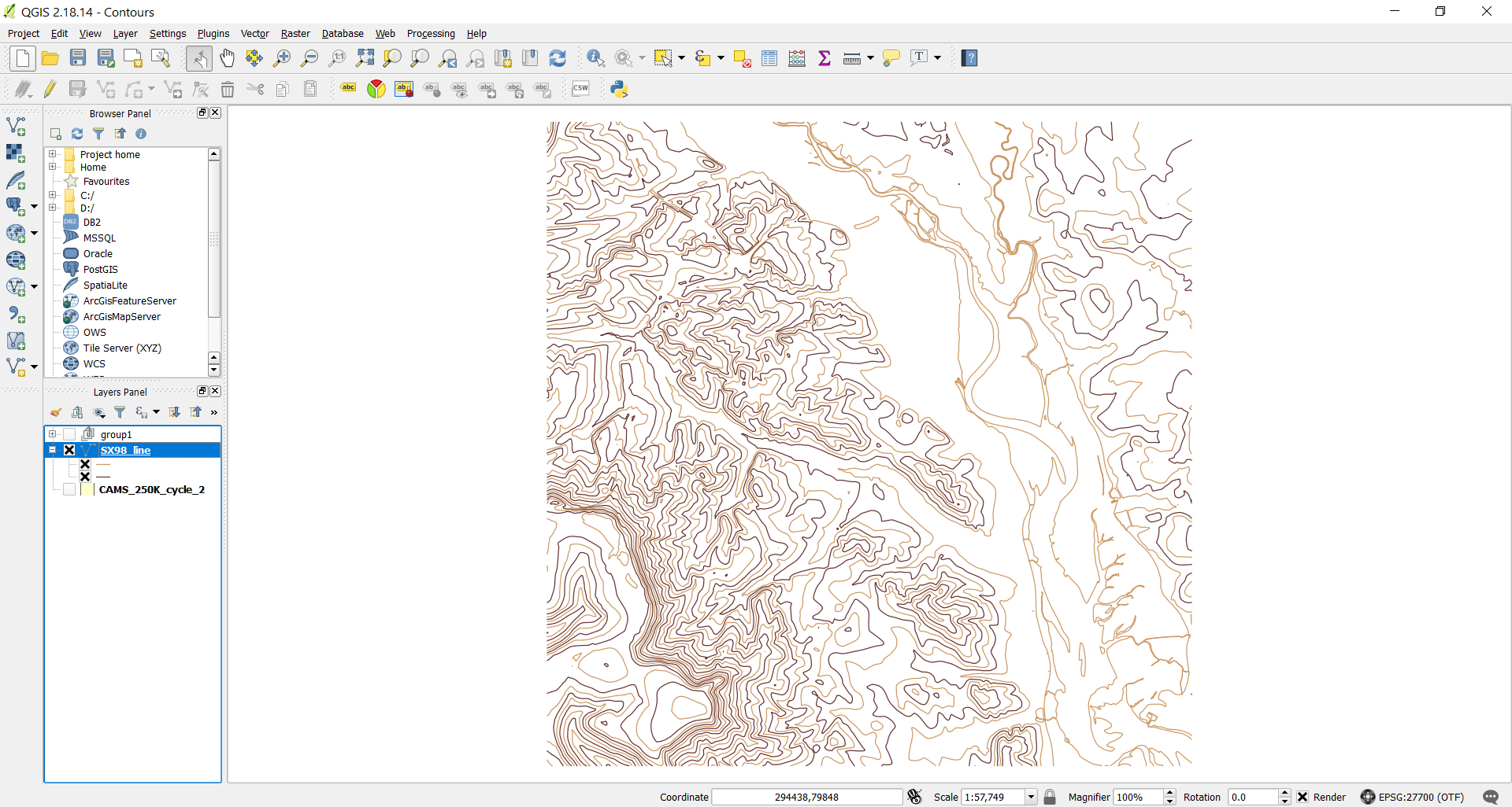
Meanwhile, Andy, Harriet, Peter and Nick were playing with Joto and the Inky pHAT electronic paper display. Peter cartooned the human impact of sea level rise for Inky; Harriet linked it to the UK Hydrographic Office API to display high and low tide data; Andy drew the Globe Theatre in Joto gradually submerging under my findings above; and Nick made a Joto of the area at risk of flooding around the Exe estuary. And I surfaced for a while to get hold of some contour data from the OS that turned into something looking a lot like “Elmer the Patchwork Elephant”.

Finally, here is Andy’s excellent presentation of what we did. I also took wool and knitting needles, but didn’t find an opportunity to use them.
My main data sources and tools:
- Historical sea levels – NASA MEaSUREs project, for 1992 and 2018
- Future sea levels under climate change scenarios – CMIP5 project HADGEM3-ES model
- Jupyter with cartopy.crs, cartopy.feature, cartopy.io.shapereader, iris, iris.quickplot, iris.analysis.cartography, matplotlib.pyplot, numpy
- 10m contours – Ordnance Survery Terrain 50 product, National Grid SX and SX98 subset
- QGIS
More flood-related visualisations:
- Flood Maps – an old global one
- Will My House Be Flooded? a UK one that looks similar and has been politicised [Update: the site at willmyhousebeflooded.site is no longer available]
- Green|Blue – one I made earlier
- And one probably by Banksy…
