A response to Solnit, Rebecca (2006) A Field Guide to Getting Lost. Edinburgh: Canongate Books, and the BBC programme A History of Art in Three Colours, Blue.
I was lying on my back in the garden. It was thirty years ago, so my memory is hazy. But I remember it being 10pm and still light, so it must have been close to midsummer. The sky was a deep blue, cloudless; no distance to focus on, to measure. I lay on my back and stared up towards the sky, and lost myself. My eyeballs were engulfed, squeezed in their sockets. My brain reeled with vertigo as my body floated bluewards.
In A Field Guide to Getting Lost, Rebecca Solnit writes of the blue of distance: “For many years, I have been moved by the blue at the far edge of what can be seen, that color of horizons, of remote mountain ranges, of anything far away. The color of that distance is the color of an emotion, the color of solitude and of desire, the color of there seen from here, the color of where you are not. And the color of where you can never go.”
She writes powerfully of desire, as inherent to the human condition as blue is to distance, of cherishing the desire and loving the distance. She quotes Simone Weil: “Let us love this distance, which is thoroughly woven with friendship, since those who do not love each other are not separated.”
And she writes of the history of blue in art, which prompted me to catch up with the recent BBC programme A History of Art in Three Colours, Blue.
The programme takes a tour of the arrival of lapis lazuli rocks in Venice, fragments of sky used to produce the pigment ultramarine, literally ‘over the sea’; of Giotto, the first to use blue to portray heaven in the Scrovegni Chapel in Padua in c.1305; of the masters that followed Giotto and applied blue only to heaven or the Virgin Mary; of Titian, who liberated blue from the “shackles of religion”; of Picasso’s blue period.
The key theme is that of Solnit’s: blue is all around us in the sea, sky and horizon, and we are beguiled, because the “great blue beyond” is unattainable. In Novalis’ novel Heinrich von Ofterdingen, which had a strong influence on German Romanticism, the blue flower symbolises inspiration, love, desire, and the striving for the infinite and unattainable. Yves Klein wanted his patented colour International Klein Blue IKB79 to be a means of escape from materialism, to be deep, rich, open and liberating. Engaging with his paintings is less a search for meaning, more a way of experiencing and enjoying freedom.
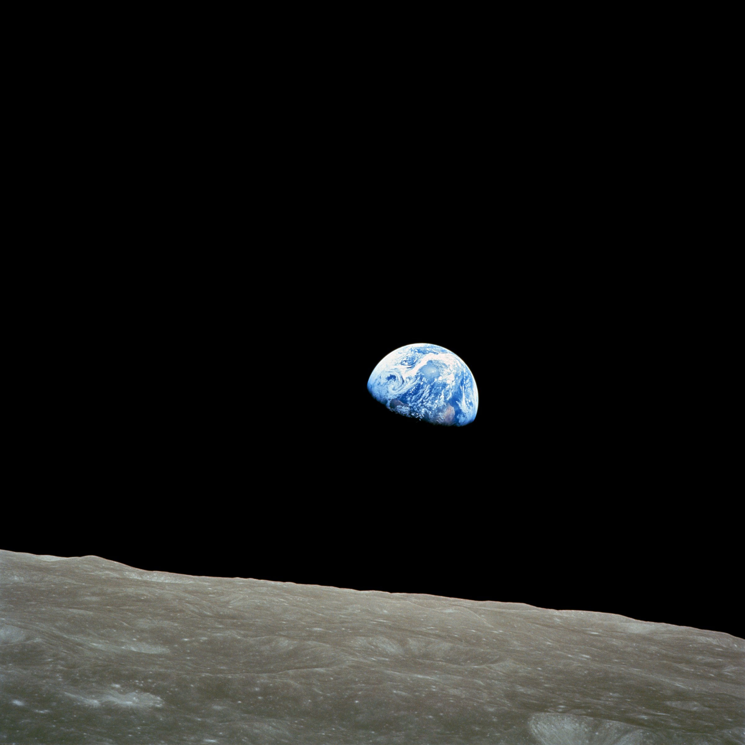
But the programme ends with Earthrise, the photograph taken by Bill Anders as Apollo 8 orbited the moon for the fourth time. Blue is now no longer the colour of other worlds. It is the colour of our own planet. Here is the irony: that blue is used to portray the divine, the infinite, and the unattainable wide blue beyond, while it is in fact the colour of home.
Solnit is saying that even when we reach that point which had been the horizon, or those remote mountain ranges, they are blue no longer. As I write, I look out of my window, and see blue only in the sky. There is little natural blue as I walk around my suburbs or in Ludwell Valley Park. So my questions are whether the blue of distance can, like a Klein bottle, curve round on itself and lead me home; whether my intellectual blue skies pondering can lead me to a deeper present; and whether I can learn to love the distance, because it reveals my desires.
Some 15 years after I lay in that garden, I pointed my camera at the cloudless blue dome above the island of Iona and took a photo. The print shop didn’t print it, and I didn’t notice until it was too late to ask why. Perhaps the staff took it upon themselves to quality control it, or perhaps the print machine couldn’t focus to resolve the colour, or perhaps it couldn’t compute blue skies in Scotland in April. But in that ‘thin place’, the sky was present to me and I to the sky. And so I want my home to become a thin place, and I want always to see with the blue-tinted contact lenses that I put in my eyes each morning.